
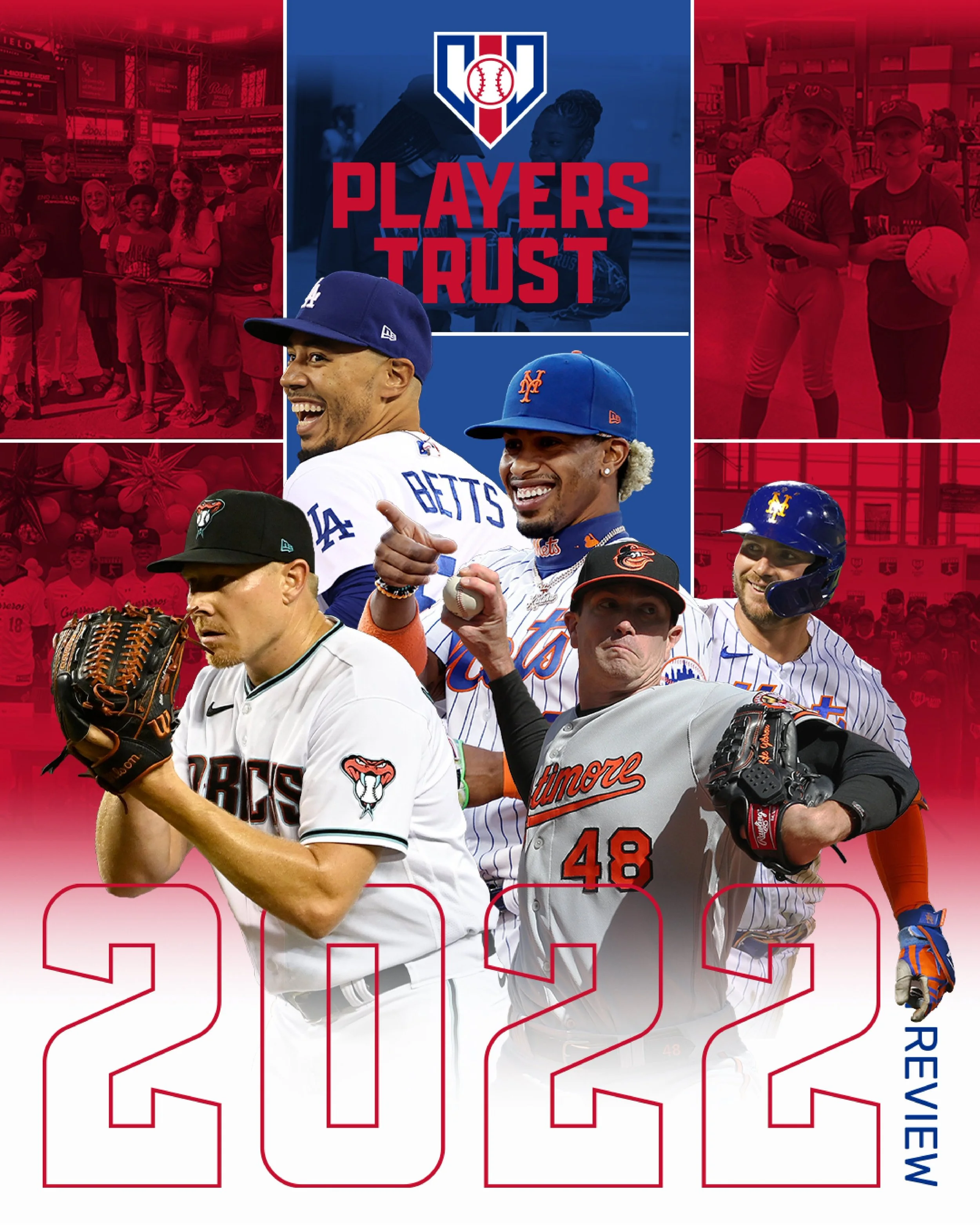
Freelance • Design Direction • Brand Identity • Brand System
The Players Trust had grown into a respected nonprofit with 20 years of impact. Their logo hadn't grown with them.

Original Players Trust Logo
Coleture Group brought me in as lead designer to rebuild the MLB Players Association and Players Trust visual identity. They’d grown from a grassroots effort into a respected nonprofit and their quickly-made original logo no longer reflected an organization run by professional athletes with a 20-year track record of impact.
The Ask:
Modernize the brand mark to elevate their presence and position themselves for future growth.
Color Palette
I chose an impact-defining near-primary red, white, and blue color palette.


Approach
Initial sketches were developed based on a three-tiered approach to give the client strategic range and temperature check.
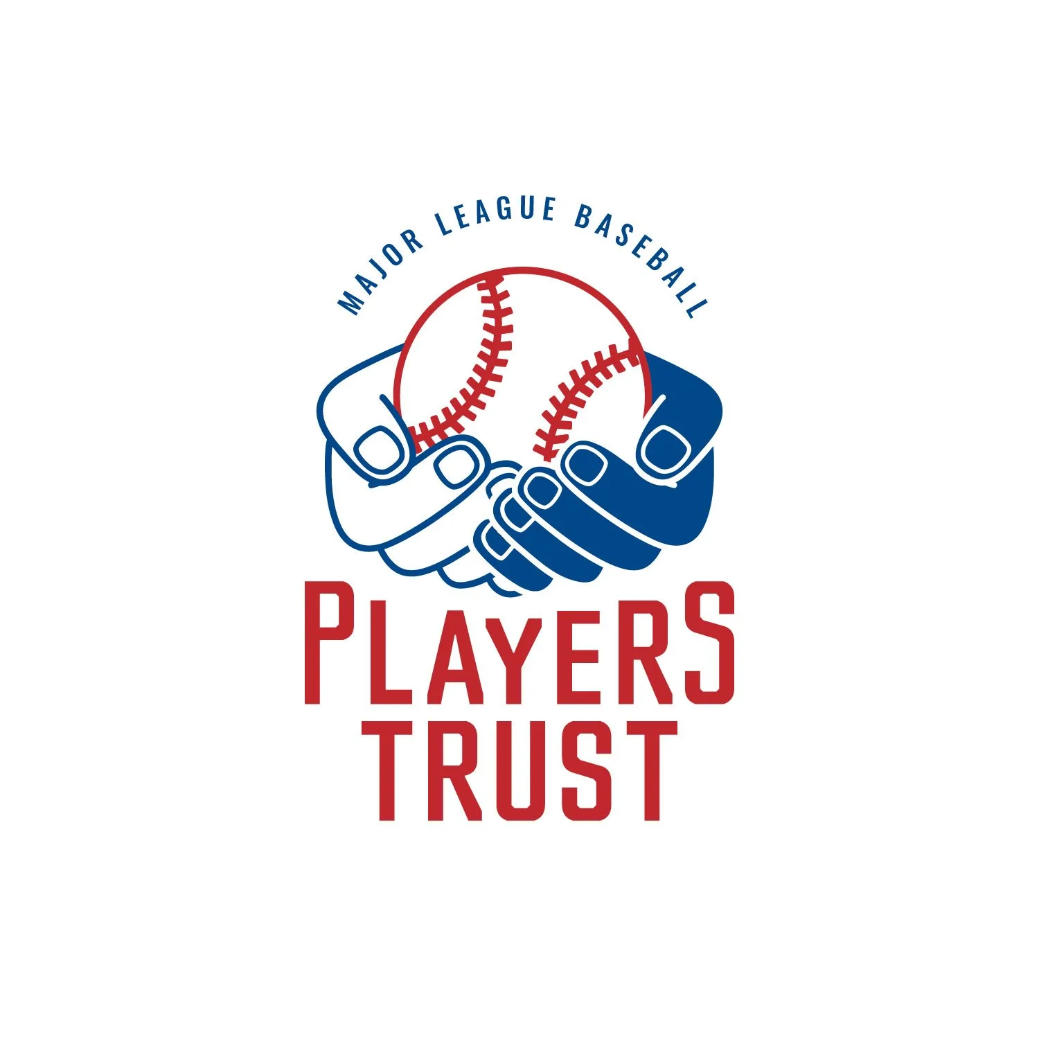
Tier 1:
A modernization of their current brand identity, better suited to meet their current needs and the state of the marketplace

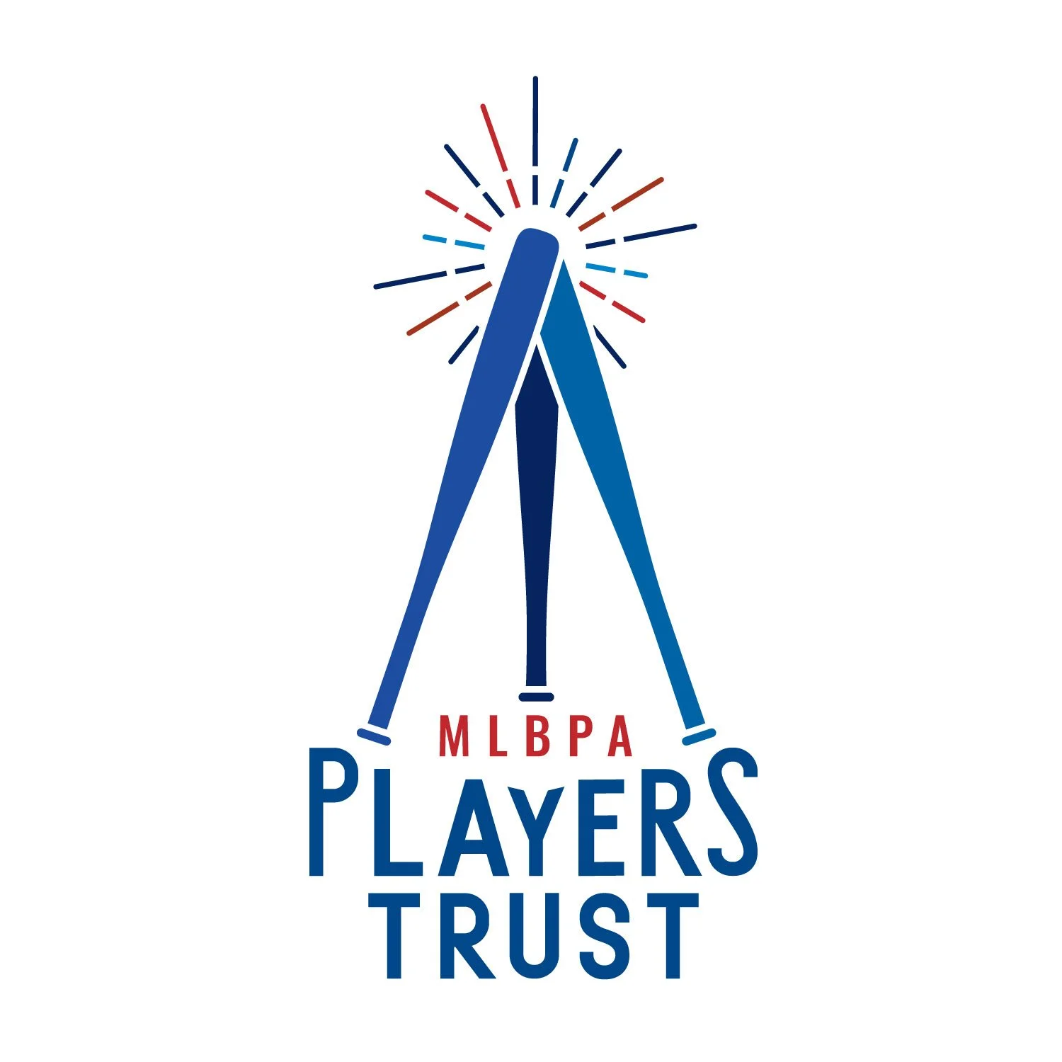
Tier 2:
A logo that includes elements of the brand and its strong platform but with a new look and feel

Tier 3:
An entirely new brand concept
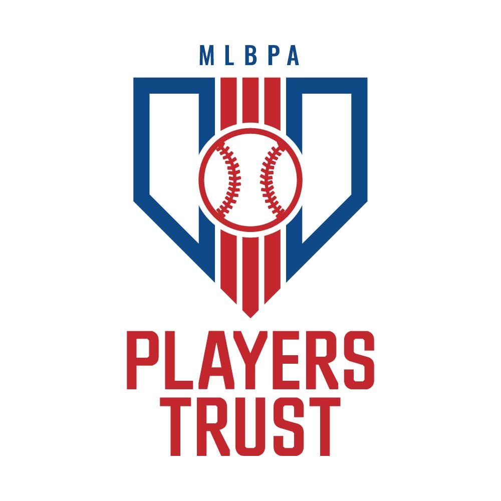
Approved

Brand Mark
I built out the approved mark into a full system: vertical, horizontal, logo marks, varying color versions, both CMYK and RGB files.












The Outcome
The new diamond mark is now the Players Trust's official identity, live across their website, social, and print, finally looking like the twenty years of impact behind it.
Agency: Coleture Group, NY