OG Sake

The Ask:
Bring sake out of the sushi bar and into the mainstream. Develop packaging that would stand out for a new kind of sake drinker.
-
Approachable and urban, the brand should appeal to health-conscious consumers looking for something clean and easy to drink.
Make it modern, feminine-leaning but inclusive, and highlight what sets it apart: no gluten, sulfites, tannins, GMOs, or added sugar.
-
I researched the category to understand where sake fits in today’s beverage space—identifying opportunities to reframe the category and broaden its appeal. Then, developed mood boards to explore visual cues aligned with the brand’s goals.
From there, I explored design directions that felt premium and sophisticated, yet inviting, while emphasizing the product’s unique (and extensive) selling points.
The result: a clean, confident aesthetic with soft-edge appeal—feminine-leaning but inclusive. Designed to stand out at dinner parties inside and rooftop parties outside.
-
I developed a first round of launch concepts to help bring the brand into culture and create buzz beyond the shelf.
One idea: A limited-edition can draped in an “OG chain” that doubles as a wearable accessory—giving a nod to the "Original Gangster" namesake. A statement piece blending this new sake clientele to hip-hop nostalgia for the New York City launch.
Round One Designs
-
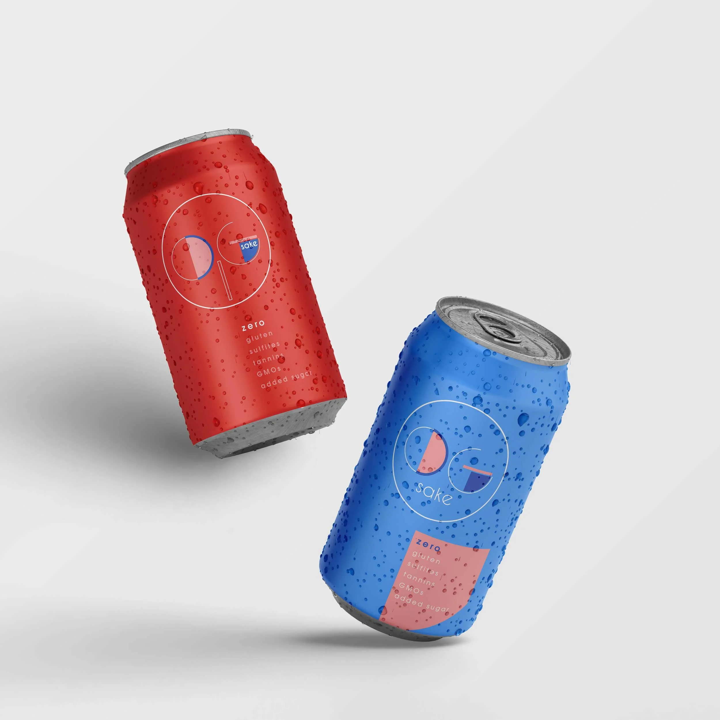
![]()
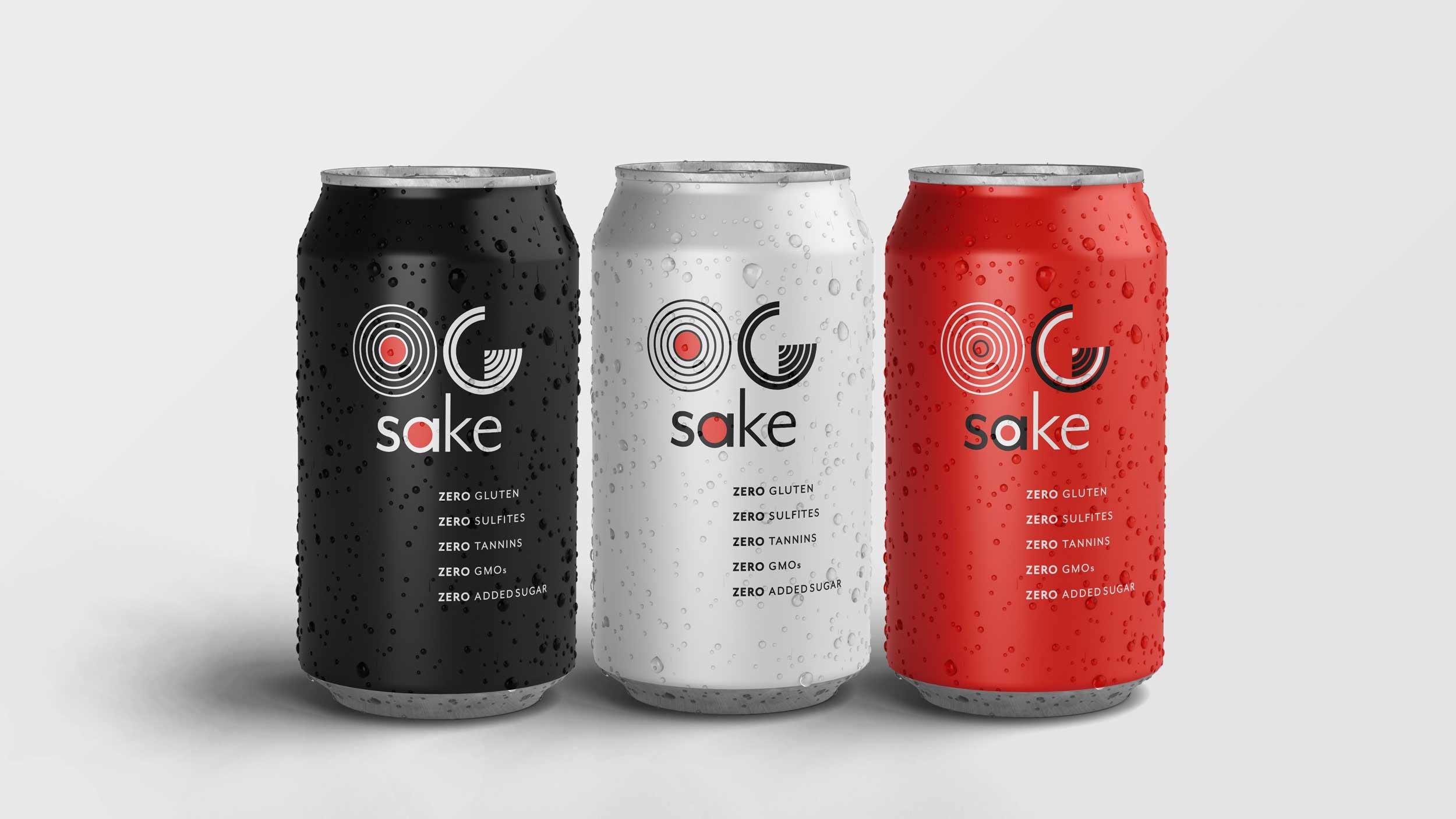
Original Gangsta Gals
Modern, clean, nod to the Founders' namesake with a Special Edition can for launch that comes with an "OG chain" that doubles as a wearable accessory.
-
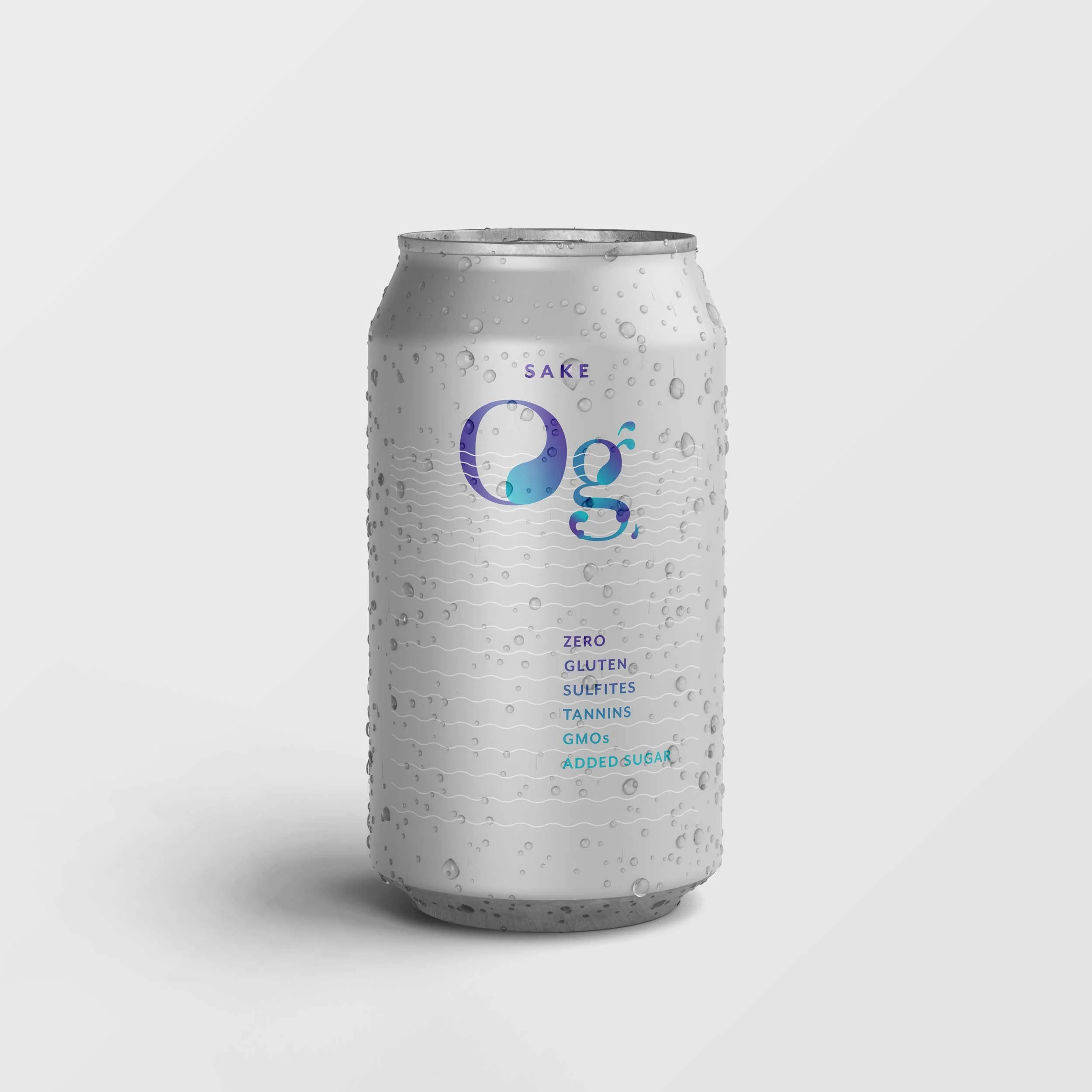
![]()
Japonica
Non-gender specific, modern, clean, bold, color nod to Japan.
-
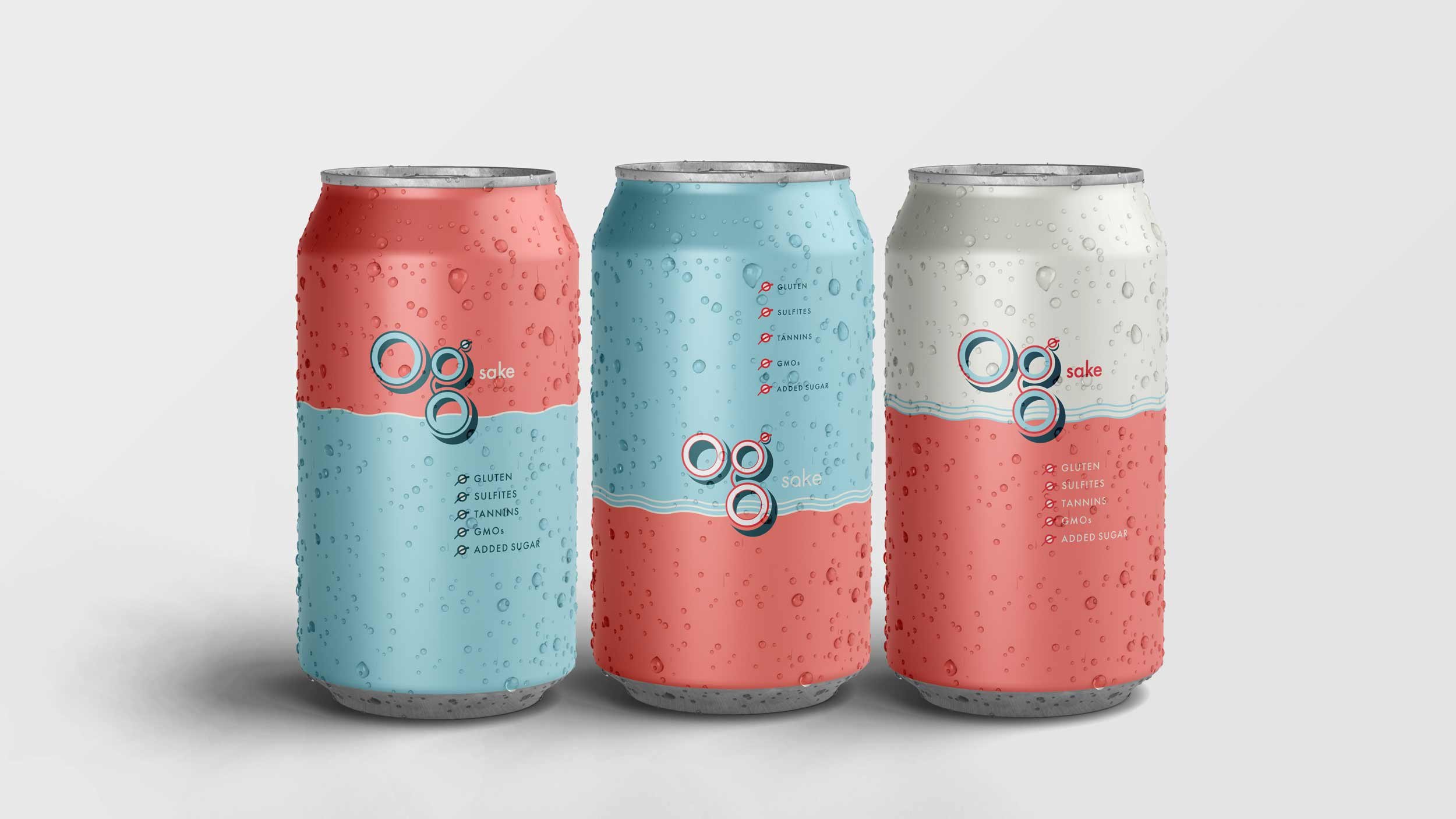
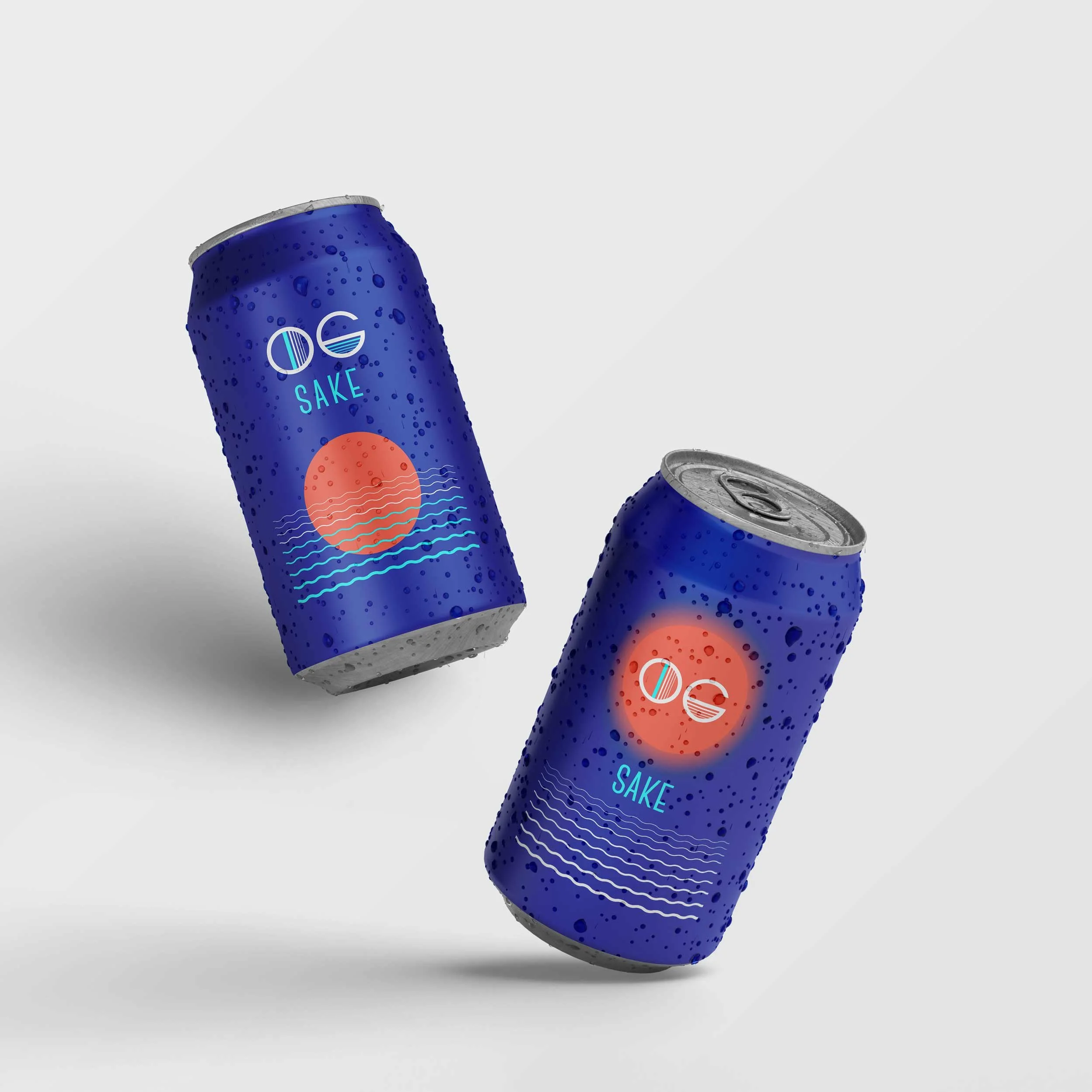
![]()
On a Boat
Nod to spirit and occasion for sake. For Round 2, client direction was to lean more girly.
-
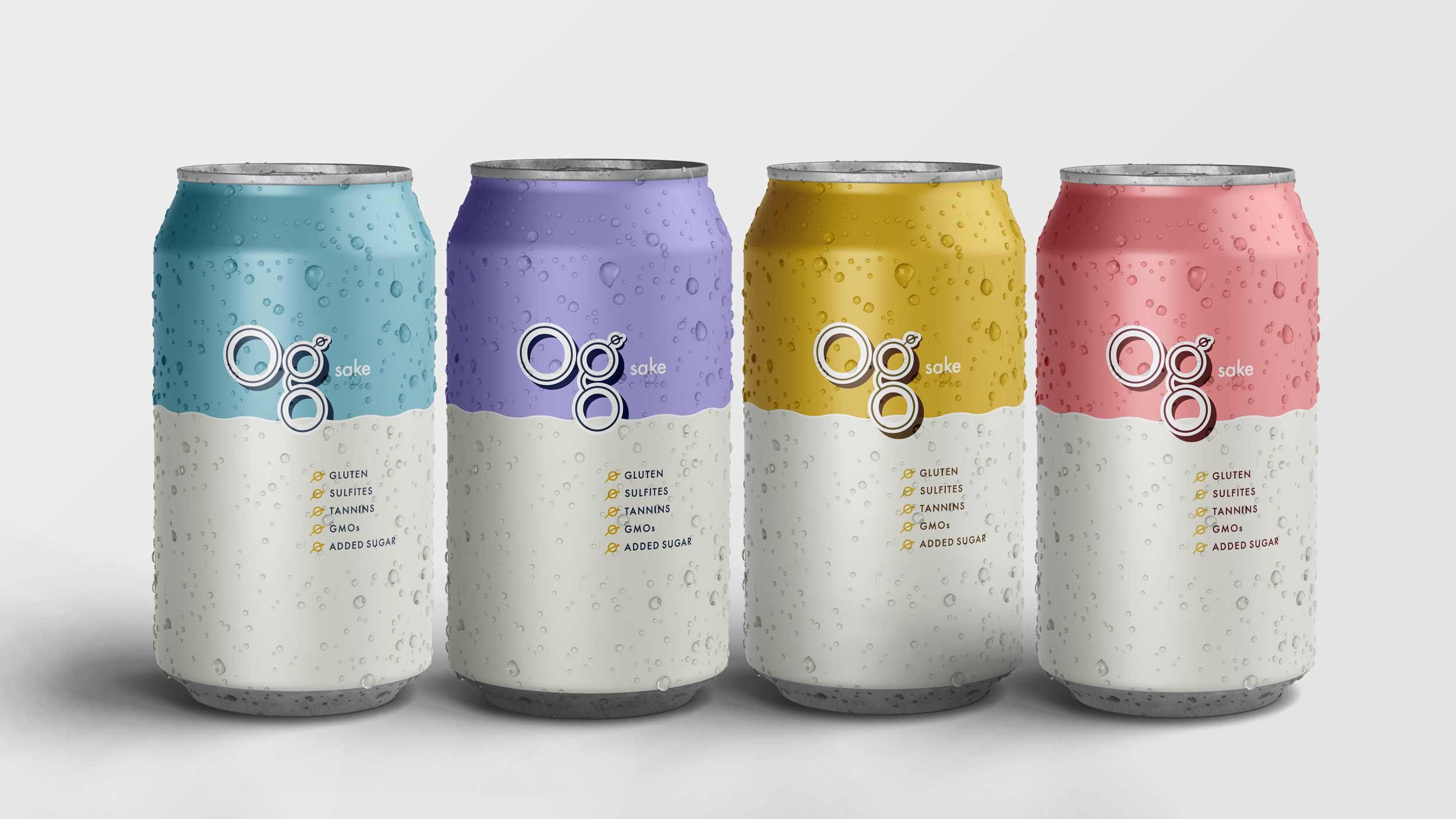
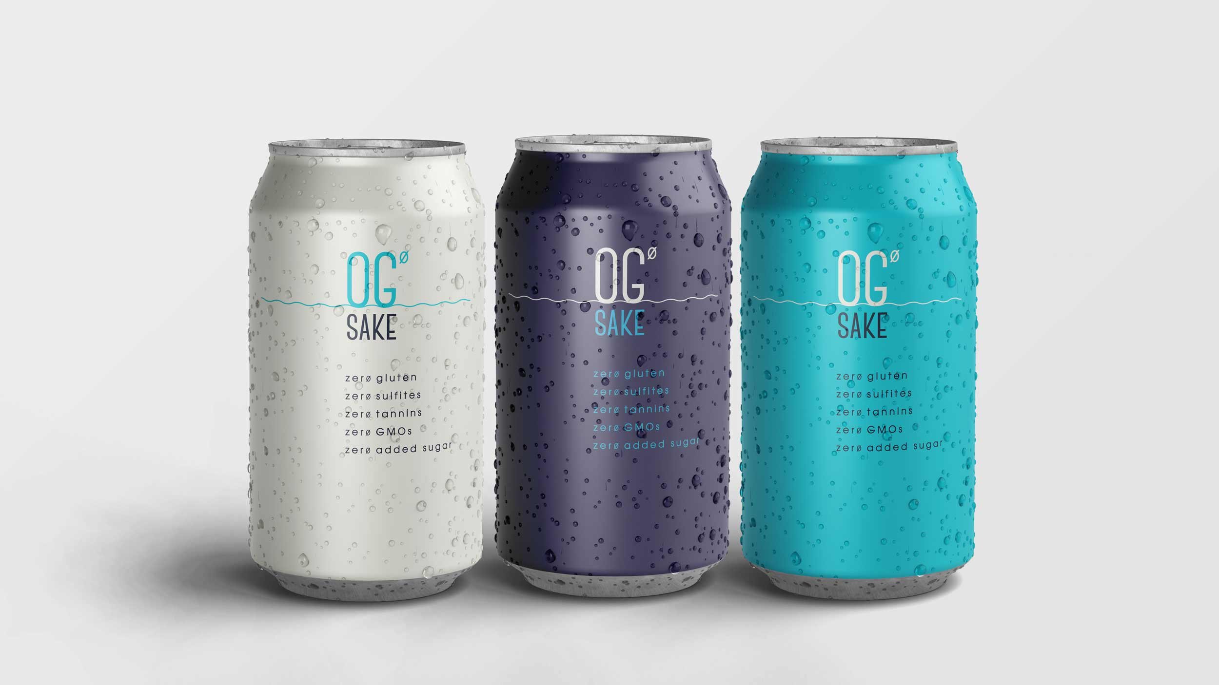
![]()
Top Zero
Non-gender specific, modern, clean, nod to zero. For Round 2, client direction was to lean more girly.


Round Two Designs
-
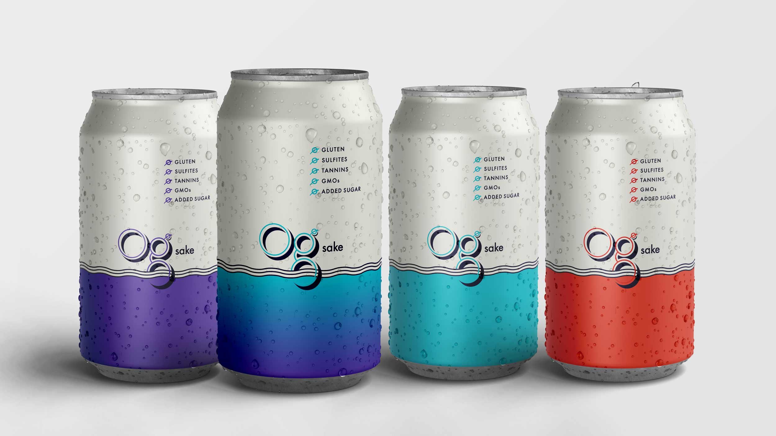
![]()
Top Zero
Sake Buddies.
-
![]()
On a Boat
Mid-Week Vacation.
-
![]()
On a Boat
Every Day is Summer.
-
![]()
Top Zero
All My Friends.

Initial Sketches
Role:
Designer, Creative Partner
This project got put on hold indefinitely once the pandemic hit in 2020…but I really had fun doing it and I def made myself thirsty for sake!